Template charts
In Template Studio, you can add charts to any template to graph data from its data views or from the template's own grid, producing sophisticated, professional-quality charts:

The available formats include bar chart, column chart, line chart, area chart, and pie chart.
You customize the chart by adding or removing elements and changing their properties.
Example: To add a secondary value axis, you turn on that option, and then specify the data series that should populate that axis.
When working with charts, it helps to understand the terminology. If you have a question that's not answered below, try the template charts FAQ.
Add a chart to a template
Add a chart
- Select any cell or cell range in the data view or in the template grid.
- Select Insert > Chart.
Move a chart and/or re-size it
- Click and drag the chart.
- To re-size the chart, drag the side or corner nodes. (If you need more control over sizing, see below.)
- To move and/or re-size more than one chart, first Ctrl-click to select them.
Note: After you add the first chart, in the left side panel, the Chart drawer appears, listing the first and each subsequent chart in the template:
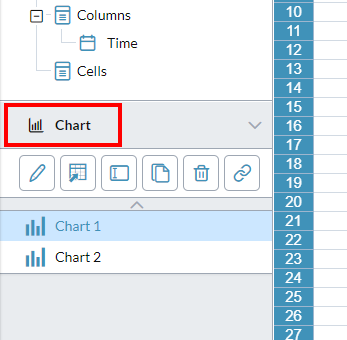
Use the options in the drawer's lip to manage your charts, including renaming, copying, and deleting them.
Define a chart
You access most of the properties of a chart in the Edit Chart dialog.
-
Open the Edit Chart dialog: in the Chart drawer select the chart and click .
Tip: After you close Edit Chart by clicking OK, the Edit menu's Undo and Redo options become active and can be applied to your chart edits.
- To adjust the Data source: edit the co-ordinates or click to open the Select Data Source dialog.
- Optionally, if you have styles available select from Applied style. (To learn more about styles, see below.)
- Optionally, you can select a different Color scheme.
- To change the chart type, open the left tray and select different chart types and sub-types and view the result.
- To reveal the elements that define the chart, open the right tray by clicking .
-
To enable/disable any element, click ; to access its properties, click .
Note: Many of the available elements derive from the chart type you choose. To learn about an element not described here, see the sections below.
Most of the properties in the elements are self-explanatory; when you change a property, the result instantly appears in the chart.
- To add a secondary axis: in the Data drawer, from Series select the data series that you want plotted on the secondary axis, and click . (A secondary value axis measures a second data series, and is set parallel to the first value axis.)
- To re-size the chart logically, in the Size drawer specify the dimensions; to prevent distortion, select Lock aspect ratio.
- Click OK.
- Select File > Save or Save as.
Edit and manage charts
Open the Edit Chart dialog
- In the Chart drawer, select the chart and click .
Change the chart's data source
-
Beside Data Source, click .
The Select Data Source dialog opens.
Change the chart type
- In the Edit Chart dialog, open the left tray.
- Select different chart types and sub-types and view the result.
Add chart elements
- Open the right-side tray.
- Click to enable an element such as the title.
- Click the element's drawer to edit its properties.
Give the chart a dynamic title
You can have the title automatically change to reflect its data, such as department or company division.
- In the Title drawer, select Autotext.
- For each page dimension you want to add, select from the drop-down and click .
Edit a chart element's properties
- Click to open the element's drawer.
- Most properties are self-explanatory.
- When you change a property, the result instantly appears in the chart.
Duplicate a chart
- Select the chart.
- In the drawer lip click Create Copy.
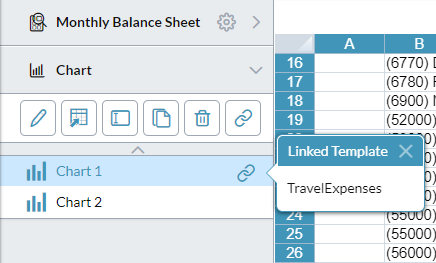
Link a chart to a template
- Select the chart.
-
In the drawer lip click .
The Linked Template Editor opens.
Identify a chart's linked template
- In the Chart drawer, select the chart.
- Click :
Manage chart data
You access most of the data properties of a chart in the Select Data Source dialog.
Open the Select Data Source dialog
-
In the Chart drawer, select the chart and click .
Best Practice: Though design mode allows you to combine data view cells and template cells for a chart's data source, we recommendsavoiding this practice: later when the template runs the chart may break owing to dynamic members or if the data view is edited.
Identify a chart's data view or cell range
-
In the Select Data Source dialog, Data Source shows the name of the data view or the co-ordinates of the cell range.
Tip: To quickly see the co-ordinates of the current data view, from Data Source select Cell Range.
Change the cell range
- Set Data Source to Cell Range.
- Click .
- Edit the co-ordinates or select a new range in the grid.
- Click .
Change from a cell range to the data view
- From Data Source, select Data View.
Change the data view
- If a template contains more than one data view, select from Data Source.
Swap the axes
- Click the double-arrow switch icon.
Series and categories
Tip: Clicking a series in the chart highlights the corresponding data in the data view.
Show/hide a series or category
- In theLegend Entries (Series) list or Horizontal Axis Label (Category) list, select or clear the series or category.
Add a series or category
- If necessary, change Data Source to Cell Range.
- Click and change the co-ordinates to include the series or category.
Add a secondary axis
A secondary value axis measures a second data series, and is set parallel to the first value axis.
- In the Data drawer, from Series select the data series that you want plotted on the secondary axis.
- Click .
Trendlines
What chart types can have a trendline?
You can add a trendline(s) to:
- clustered column/bar/line charts
- Combo Clustered Column + Line charts
- Combo Custom charts
How many trendlines can a chart have?
You can add a trendline for every series.
What if a series is plotted on the secondary axis?
Its trendline is also plotted on the secondary axis.
Can a dynamic series have a trendline?
Its trendline is plotted to the resolved series.
Can I choose the color of a trendline?
A trendline takes its color from its series.
- To change the trendline color, change the series color.
Define a trendline
- In the Data drawer, select from Series.
- Turn on Trendline.
- Select the line type (Linear or Logarithmic) appropriate to the series and chart.
-
Optionally, you can provide a custom name (up to 30 characters, or blank) and change the Line style.
Tip: If the chart's legend is turned on, the trendline name and line style appear there.
- For each additional trendline you want to add, select another series and repeat the above steps.
Chart styles
What is a chart style?
A chart style is a set of values that determines the appearance of a chart. A style is saved in a chart styles file.
Why use chart styles?
You can instantly change the look of a chart by applying a different set of chart styles.
Tip: For a consistent, professional look, use the same style set with the charts in all your templates.
How are chart styles created?
In Design mode, with the chart styling complete, the designer saves the style settings to a chart styles file.
How can I tell what style set is in use in a chart?
The Edit Chart dialog's Applied styles property indicates the current style set in use, and always shows one of the following:
- Default: The chart is using the default styles (this means you have made no changes).
- This chart: The chart is using its own style properties, stored in the template (this appears after you make changes to the default styles or to the style set that came from a file).
-
chart style name: The chart is using the style set from this chart style file (and will continue to unless you make a change, in which case Applied styles changes to This chart).
Note: If you manually undo all your changes, Applied style reflects this by returning to its previous state.
Can I use my Dashboard Studio chart styles in Template Studio, and vice versa?
Although both apps allow you to create chart style files, the files are not interchangeable.
Work with chart styles
You work with chart styles in the Edit Chart dialog.
Create a chart style
- Beside Applied style click .
- Name the chart styles file.
- Click OK.
Apply a chart style to a template
- Beside Applied style, click .
- Select Open Style.
- Select a chart styles file.
Update a chart style
- Make your changes to the chart (Applied styles changes to This chart) .
- Beside Applied style click and select the chart style file and save it, overwriting the old version.
Use a different chart style
- Beside Applied style click .
- Select Open style and choose a different chart style file.
Return to the default style
- Beside Applied style click and select Default style.
Override the color scheme for a series
- In the right-side panel, open the Data drawer.
- Select the Series.
- In Fill, select the Color.